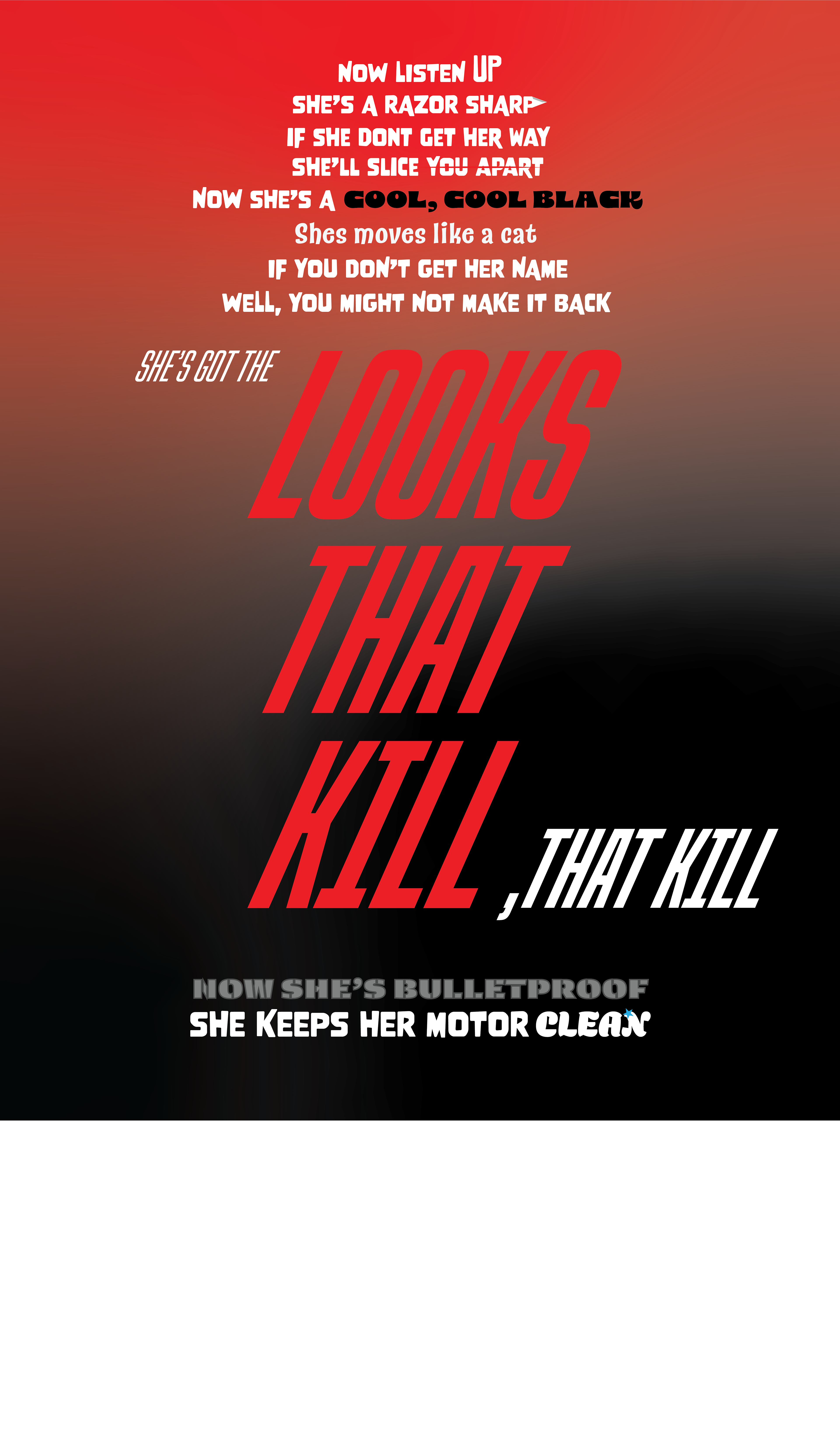
I was meant to adapt a song into a graphical way. As a Motley Crue fan, I decided to do "Looks that Kill". I used the colour theme from the album as well as visual elements to emphasize words.

I'm honestly not entirely sure what this was for, but I recall being in groups, and we each had an element to design for a brand. I was given the logo. This was created in roughly 2 hours, and it is one of my favourite pieces.
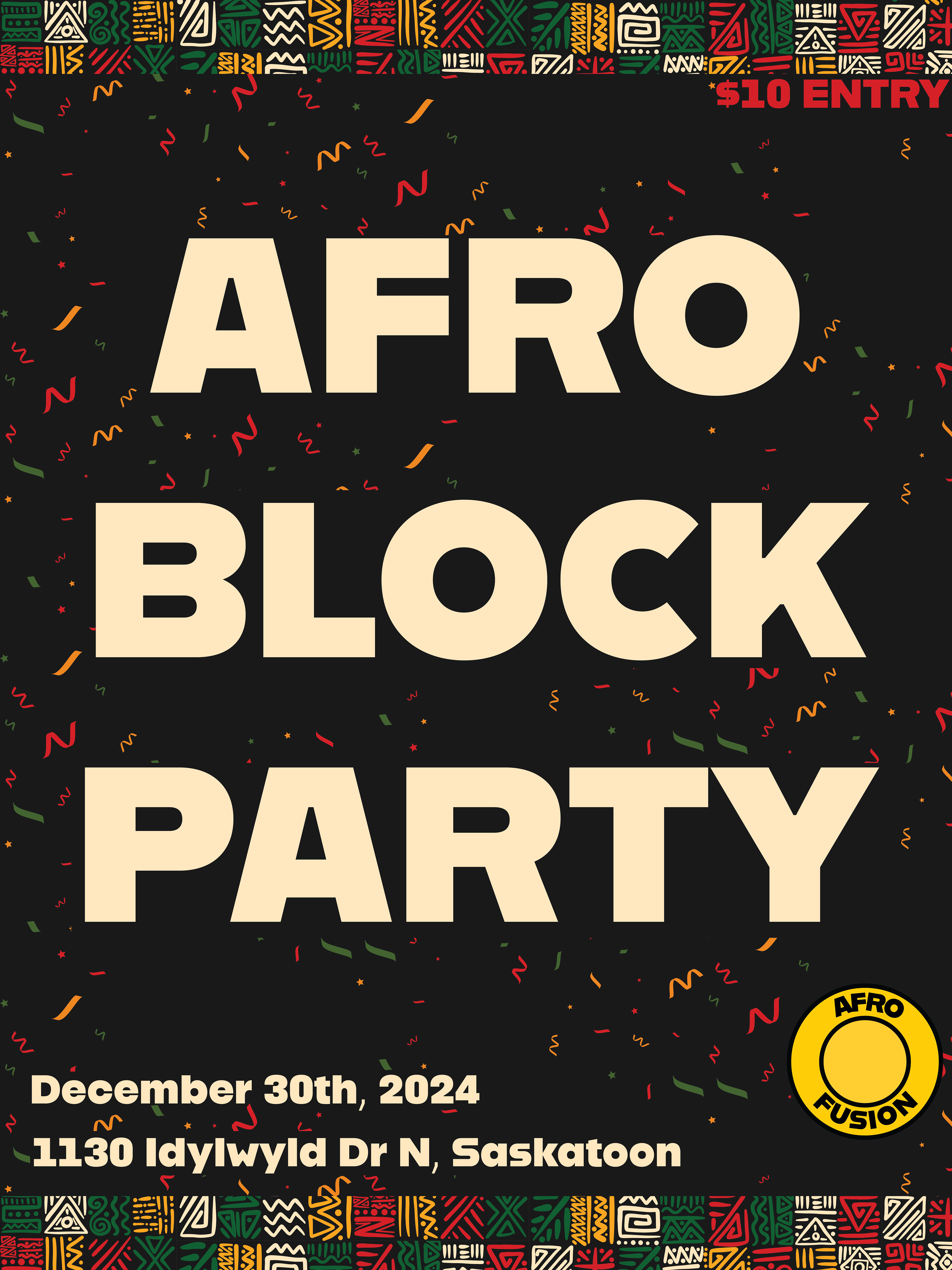
This one also took me around 2 hours. We were given an event by a classmate, and we had to make a poster for it. Mine was for an African Block Party.
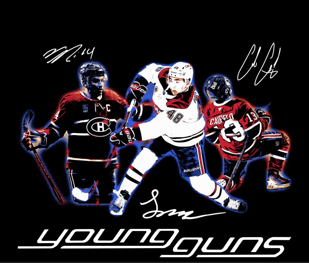
This was for a vintage-tee design that I tried out. I used images from online and then did the graphical elements for the weathering, outlining, colouring and the signatures/young guns tag.